Identity & Redesign
The Poetry Review
The Poetry Society
The Poetry Review
The Poetry Society
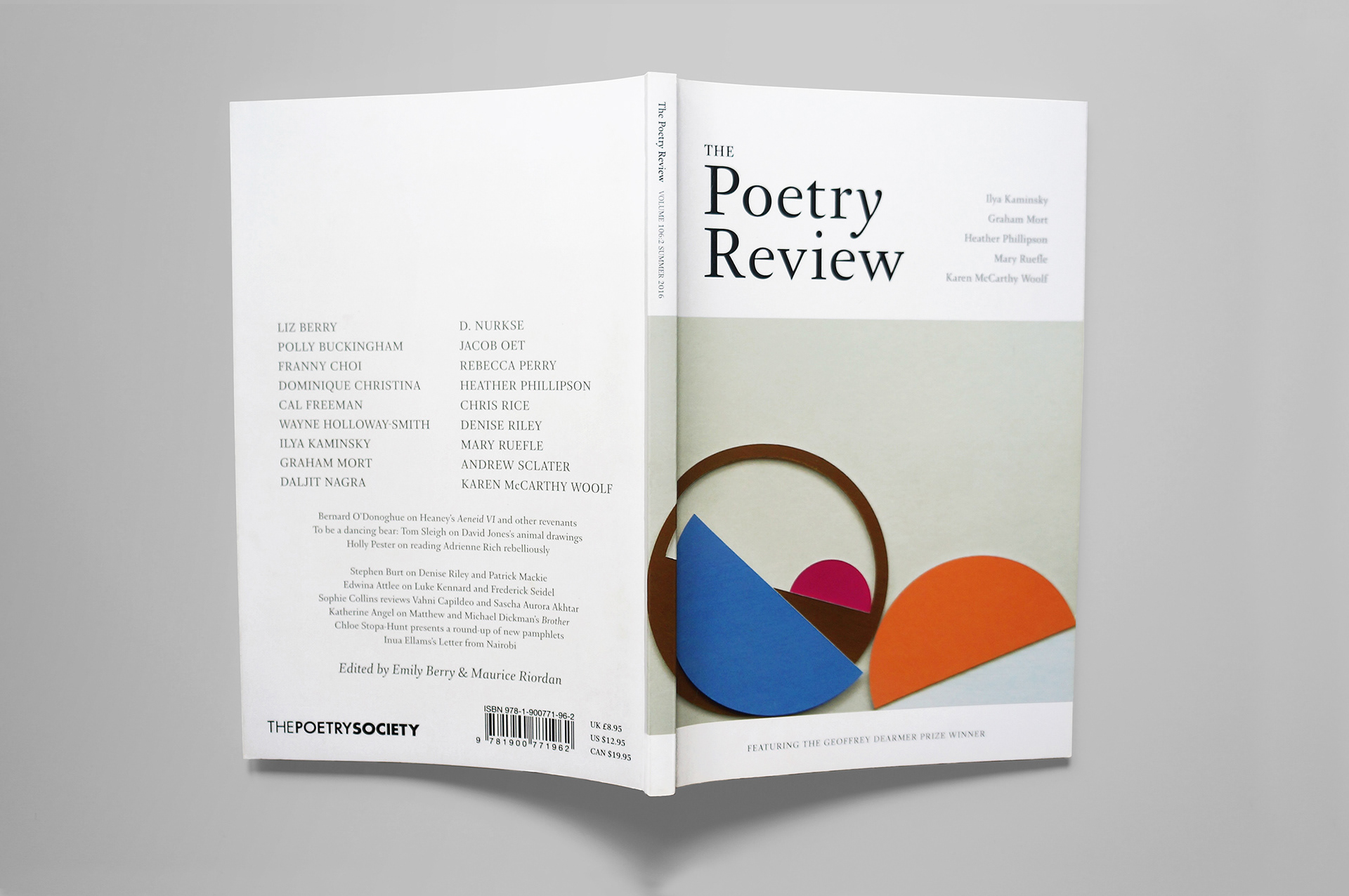
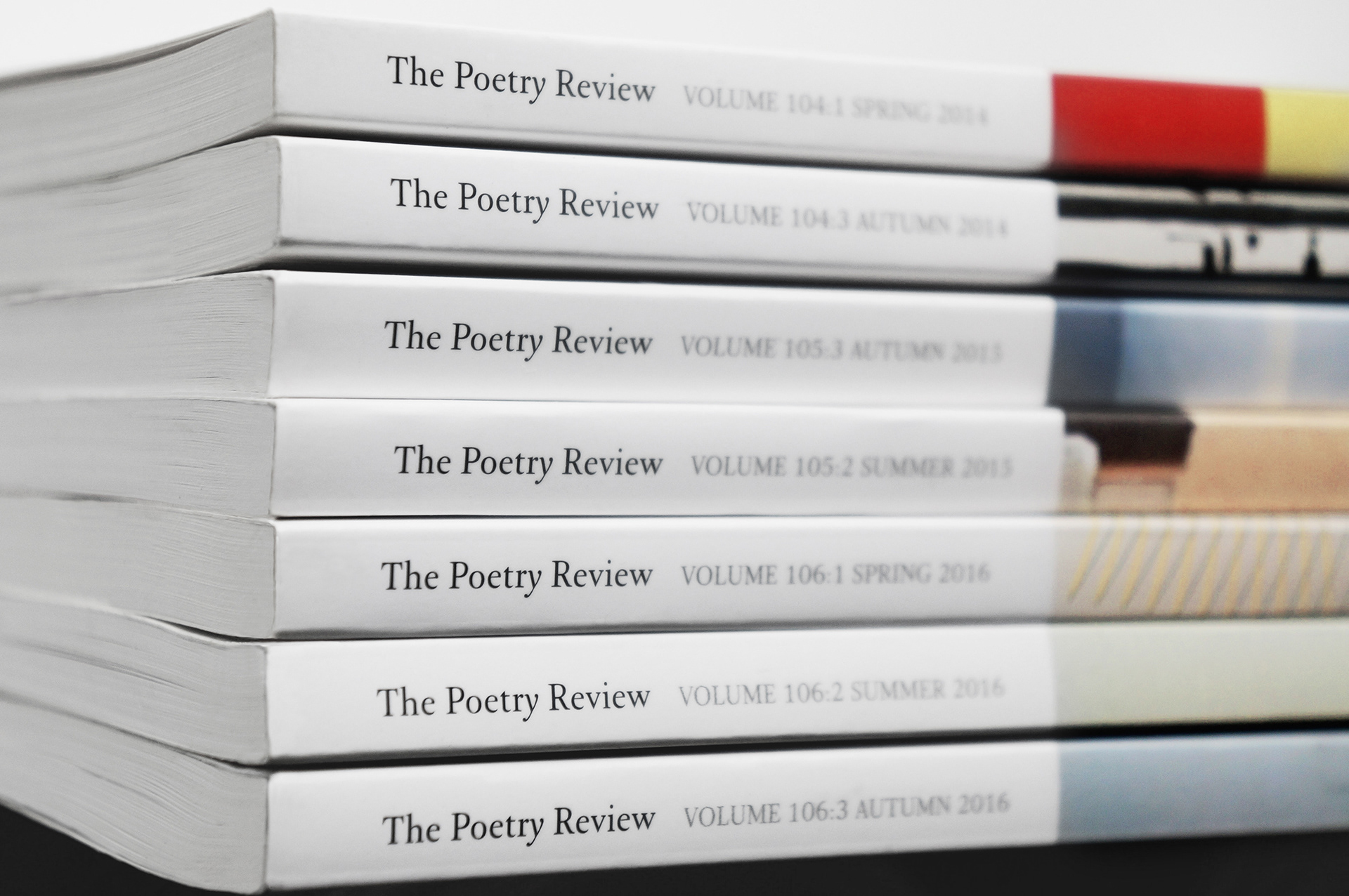
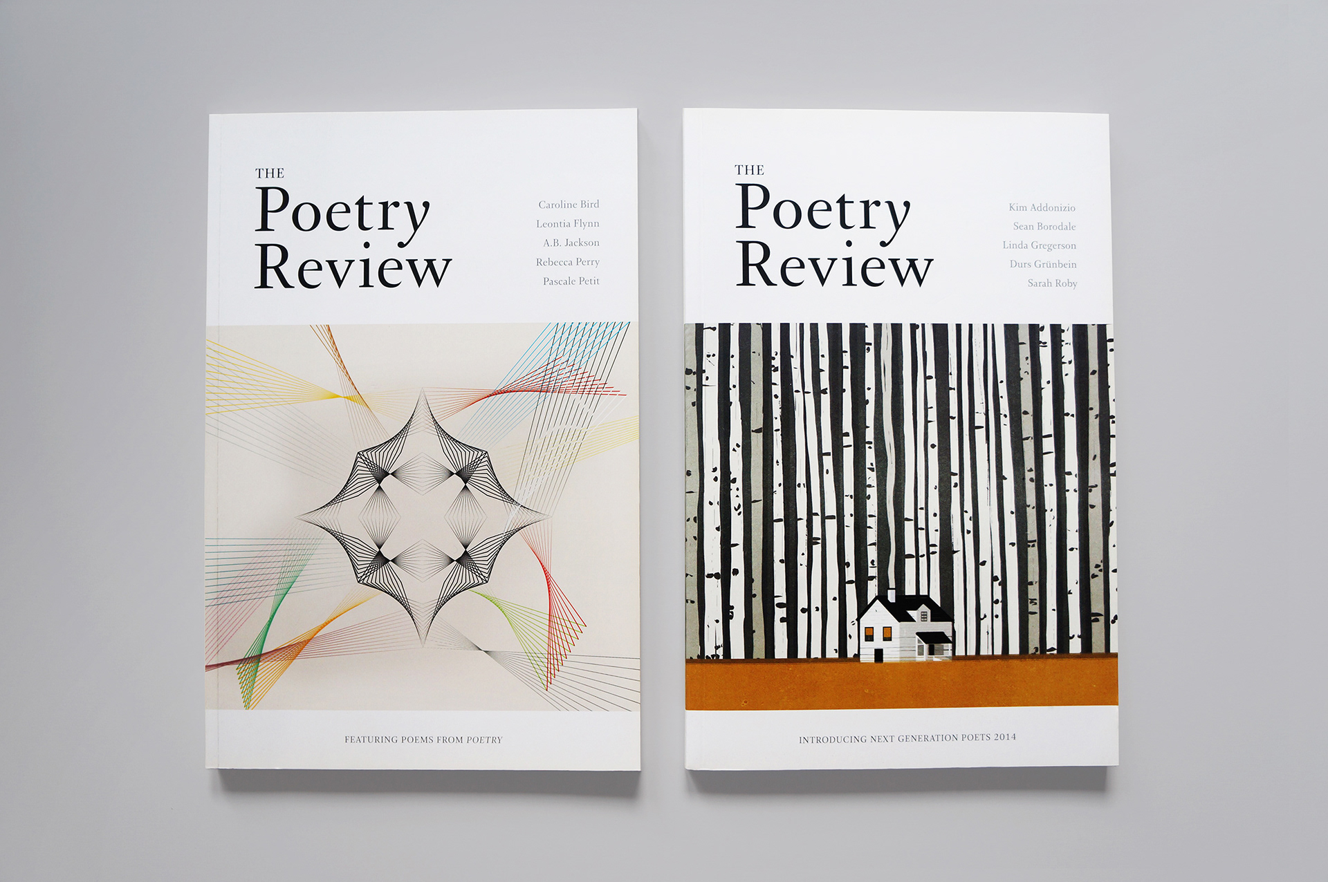
The quarterly Poetry Review was first published in 1912 and this was its first redesign for more than ten years.
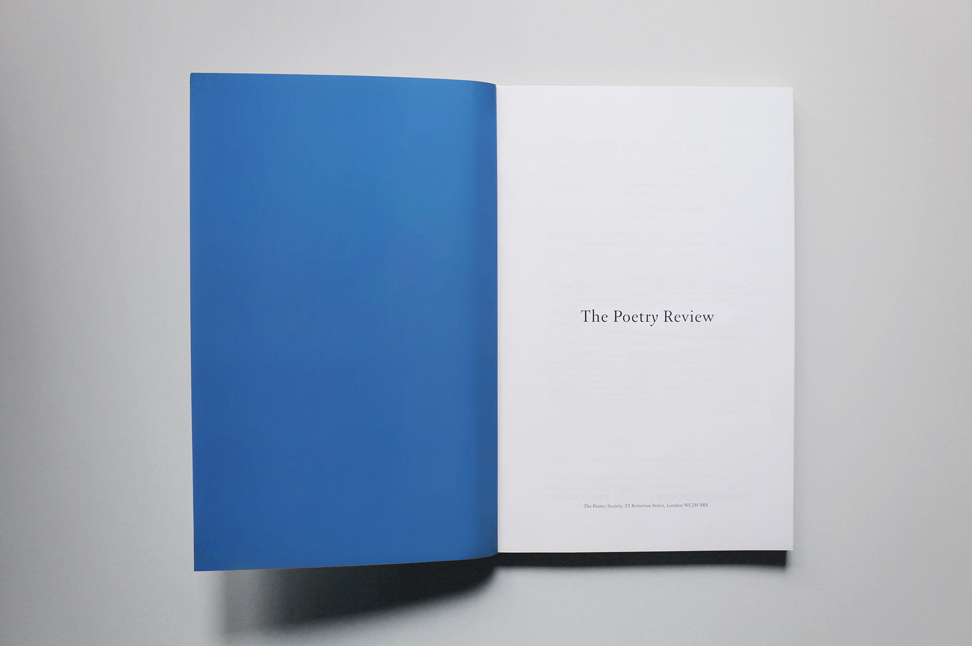
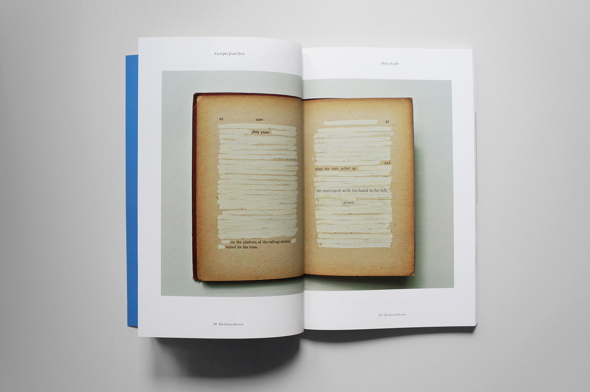
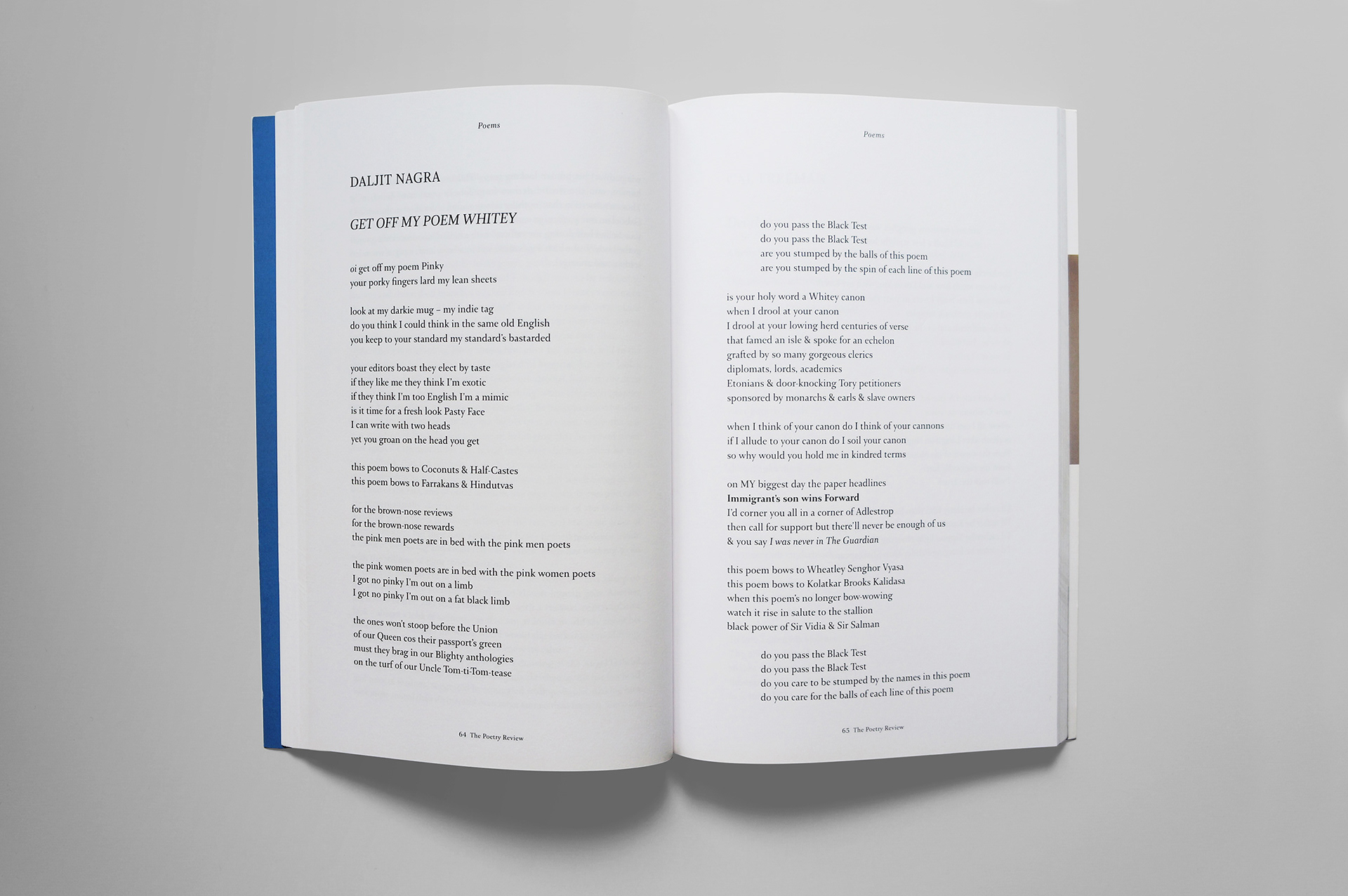
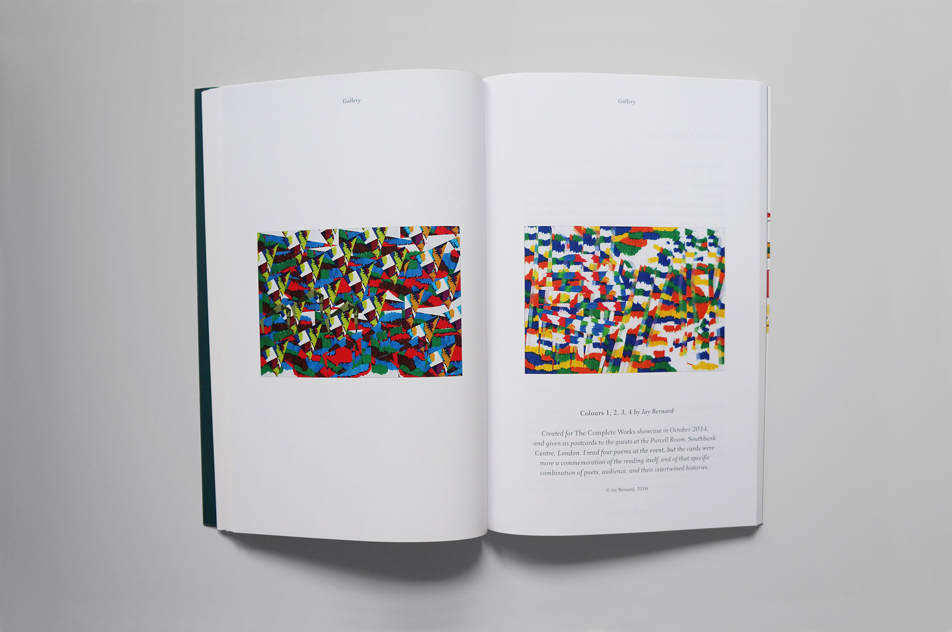
The team at The Poetry society wanted to revitalise and modernise the look of the magazine whilst ensuring a direct link to its rich design history. I brought in a new format, new typeface and reintroduced ‘The’ to the title for the first time since 1969. The magazine was relaunched in a new ‘pocket-sized’ format, more emphasis was placed on the use of illustration and the Arnhem typeface is used exclusively throughout.
The team at The Poetry society wanted to revitalise and modernise the look of the magazine whilst ensuring a direct link to its rich design history. I brought in a new format, new typeface and reintroduced ‘The’ to the title for the first time since 1969. The magazine was relaunched in a new ‘pocket-sized’ format, more emphasis was placed on the use of illustration and the Arnhem typeface is used exclusively throughout.
Editor Maurice Riordan said: ‘Just a tad retro, and very 21st century, The Poetry Review now brings the reader the tactile familiar quality of a print magazine with an up-to-the-minute design'.